An open guide to digital accessibility, written for every product team in Russia
My role
I initiated the project and defended it before the MTS board. Rita Konstantinova, a product lead in my department, ran it day to day.
My team
Volunteers from across MTS: the designers behind WorkZen, developers, testers and editors.
The problem
More than 12 million people in Russia live with a disability or a sensory impairment. Another 37 million are older people whose sight, hearing and dexterity change with age. And anyone can be limited for a while: a broken arm, a child in one hand, a car to drive.
Yet few people in Russia knew what digital accessibility was. Large companies could afford accessibility specialists, but they were a rare exception. We decided to make digital accessibility available to everyone, with the global standard, WCAG, as our base.
The idea
Make a free public guide in Russian, written in plain words for designers, developers and testers, so that even a small team can follow it without an expert.
Run it as a charity project under the MTS brand. Test it on our own products first, then give it to everyone.

What we built
We translated WCAG and then rewrote it, so that the guide reads like advice from a colleague, not a legal text.
For every role
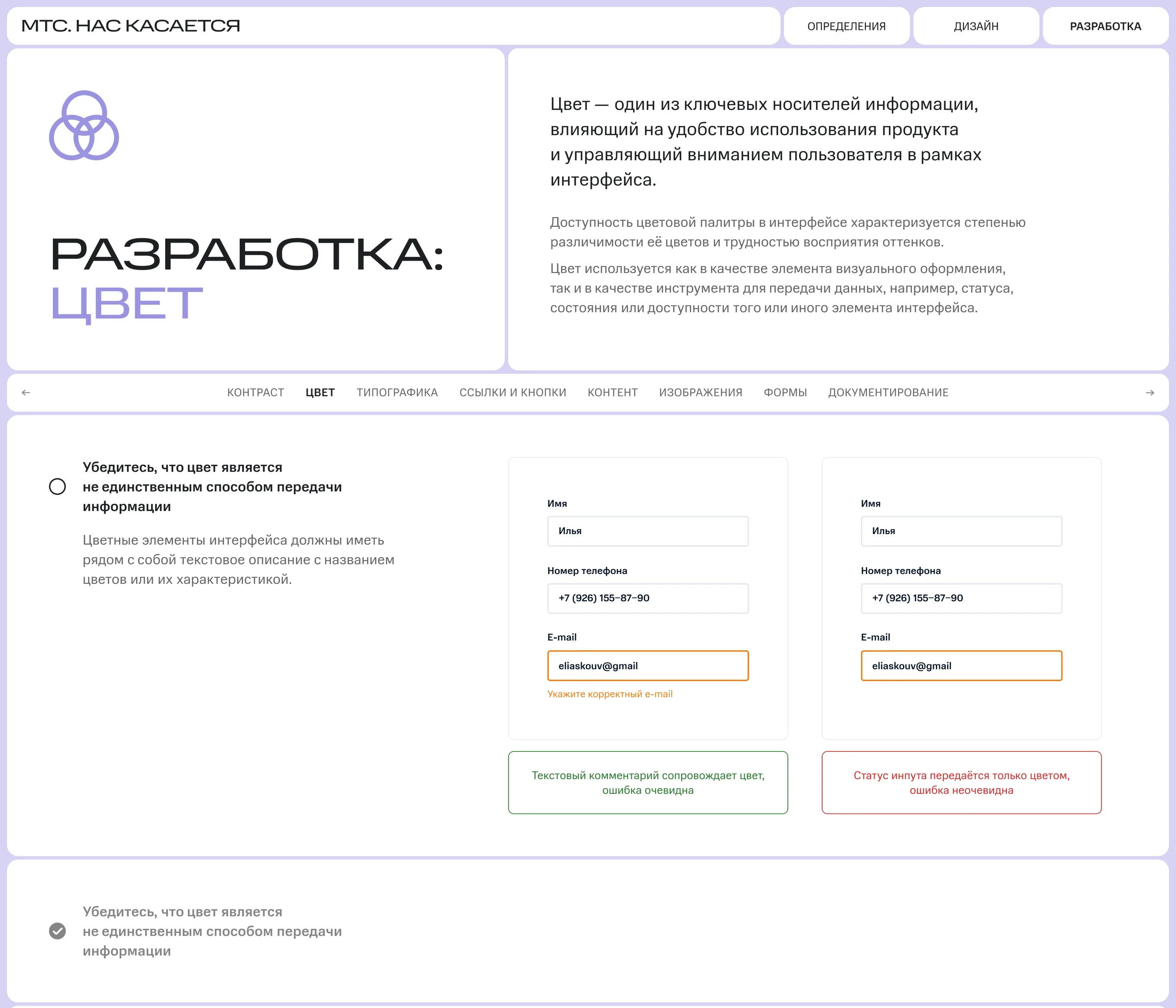
Separate sections for design, text, web, iOS, Android and testing. A designer finds rules on colour, contrast and typography, an editor on meaning, ethics and structure, a developer on navigation and debugging.
Rules you can check
Each rule shows what good and bad look like, side by side, and a checklist helps a team assess its own product against the AA level of WCAG.
Tested on our own products
We wrote the guide together with independent experts and colleagues with disabilities. The first product to follow it was the Knowing in Person website. Then WorkZen became the first MTS product to fully meet the AA level.
Results
- Free
- for any team,
from startups to NGOs - AA
- the first MTS product
to meet it: WorkZen - Every product
- at MTS now has the guide
in its standards
Takeouts
Working on the guide taught us that accessibility is not a feature for a few. A product that works for people with disabilities works better for everyone, because anyone can be limited for a while.
We also learned that a standard is only useful if people can read it. WCAG had all the answers, so the real work was rewriting them in plain words that a small team could act on.
And we saw that a volunteer project can outgrow its start. Testing the guide on our own products gave us the proof to defend it, and the guide lived on after I left MTS.